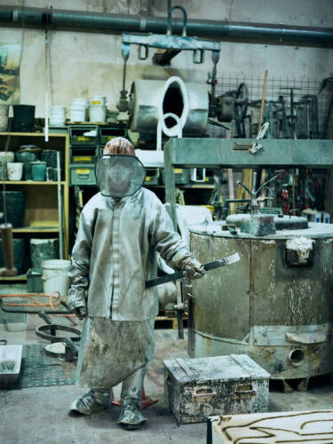
Offset Washing Paper


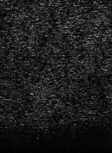

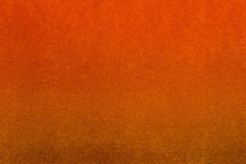


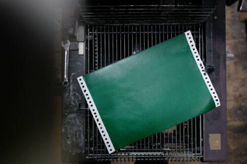


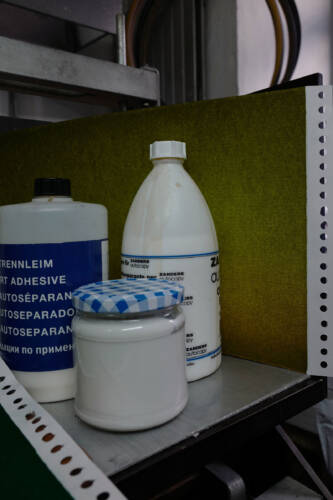
Collection:
Ollie Schaich
Print:
Rino Crescente
The pictures shown are a small selection of washing sheets used to remove ink from the rare Kompak KolorMate offset press. The result is paper in 28x36cm format that has been soaked up with residual ink. The “unwanted” prints are inked on both sides. When looking closely, one can dive into a world of randomness and discover astonishing details. The images are available as editions. Have a colorful day.
Stiftup


Design, Concept:
Ollie Schaich
Code:
Felix Niklas
Photography:
Ramona Gschwend
Ollie Schaich
Typeface:
Monument Grotesk
Synt Regular
Stiftup is a foundation for research in tumor diagnostics and prevention. Since 1997, the foundation has done everything to promote research within the field of early detection. Stiftup also supports projects that improve the quality of life of those affected. Research projects can address medical, nursing, psychological, or social issues. The challenge was to develop a visual language that breathes hope into the devastating topic of cancer. Research and treatment are stepping stones on the path of recovery. Because nature is a place and source of strength for many people, particular stones were collected in the Rhine Valley around Versam (Switzerland). Stiftup finds the bright lining leading through the various challenges, and each stone turns so that their lines connect to become one string of support. www.stiftup.ch
Image Generation


Design, Concept:
Michel Egger
Ollie Schaich
Text:
Andreas Triet
Oliver Kerrison
Typeface:
Monument Grotesk Bold
Kasper-Florio
ABC Dinamo
Image Generation, a work of research by Michel Egger, makes use of visual material found on the World Wide Web. Generated using Pinterest’s algorithm-driven search function, single images, ones that otherwise would never have come together, are put into a relationship. Formal associations and technological errors collide, allowing these duos to emerge. In parallel to this, words are used to translate the imagery into unsystematic, yet constantly internet-based information. Published by Edition Ventile with the generous support of Kulturförderung Appenzell Ausserrhoden and Kulturförderung Stadt St.Gallen. ISBN 978-3-9525332-0-8 CHF 42 EUR 40
Would you like to purchase a copy?
Have a look at the Edition Ventile Shop
Edition Ventile


Concept, Design:
Ollie Schaich
Code:
Union Union
Typeface:
Monument Grotesk
Monument Ventile
Edition Ventile is a non-profit publishing house and releases art books in A4 format that show the underestimated and overlooked. The objects made of paper are not the result of a linear process, but rather of taking detours, stopping for a break with a beautiful view, making some extra rounds and sipping a drink or two. The unexpected works and close collaborations with emerging as well as established artists intend to scratch, entertain and stimulate reflection. The name Ventile – from the Latin “ventus” (wind) – means “valve” and is a metaphor for releasing creative pressure.
Ventile Sequences


Art Direction:
Ollie Schaich
Illustration:
Moriz Oberberger
Opens automatically at high pressure. The animations show five short stories. The starting point in each case is the release of creative pressure, which often builds up over weeks, months or years and can be released through the Ventile (valve) of the self-created platform Edition Ventile. This serves as a starting point for experiments in various directions, discussions with friends and finally, after several detours, everything flows into a book – of course in A4 format.
Monument Ventile
Kulturstiftung AR


Design, Concept:
Ollie Schaich
Ruedi Zürcher
Animation:
Data Orbit
Typeface:
Droulers Regular
The appearance for the 30 years anniversary of the Cultural Foundation Appenzell Ausserrhoden is based on the representation of time (backward and forward). Due to the desired flexibility of the different format applications, the concept is built accordingly responsive. The wristwatch as a central element guides through the different guest contributions at the event itself.
Textile and Design Alliance


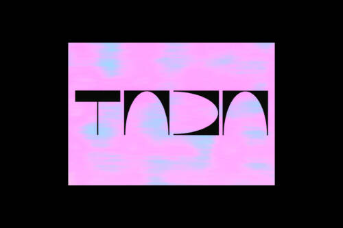

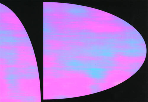


Design, Concept:
Ollie Schaich
Ruedi Zürcher
Code:
Baenziger Hug
Photography:
Stéphanie Baechler
Ladina Bischof
Quang Vinh Nguyen
Typeface:
Kunst Grotesk
TaDA – Textile and Design Alliance is a cultural promotion programme. Its goal is to promote artistic discussion with the eastern Swiss textile and design culture and thus strengthen the regional identity. A connection to practice and to the textile companies established in the region is a central component and fruitful for both sides. TaDA offers on an annual basis a work stay in Switzerland to six to eight national and international personalities. The residents develop innovative projects in the fields of art, design, architecture, literature, the performing arts or in transdisciplinary contexts. As programme partners textile and design companies in Eastern Switzerland make their know-how and technology available to the artists, thus giving the residents an opportunity to do practical and artistic work and carry out applied research. On their part the partners benefit from the creative exchange with the art practitioners invited. www.tada-residency.ch
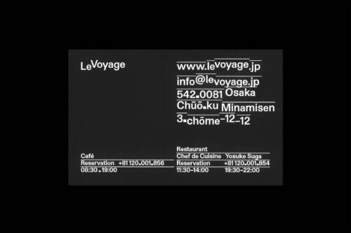
Louis Vuitton


Design, Concept:
Data-Orbit
Ollie Schaich
Ruedi Zürcher
Exploration after being invited to pitch for the worldwide first Louis Vuitton Restaurant Café, which opened its doors in Osaka in 2020. The new space was named “Le Voyage” – based in the initials and main logo, LV. The three design directions were thought upon the following key topics: DISTANCE: The space in between the “Le” and “Voyage” is based on the Louis Vuitton logotype. This space stands for traveling and the journey from Paris to Osaka, including all the stops on the go. MODULAR: Inspired by the Japanese vertical spelling, we created a system that enables implementing keywords like Osaka, Café, Restaurant etc. playfully. TIME: This concept is based on the displacement of the “L” and the “V” of the Louis Vuitton Icon. The shift symbolizes day and night and the changing timezones. The results were the starting point for the general implementation of the new identity, which was finally realized by the internal design team at Louis Vuitton.
Es braucht Mut


Design, Concept:
Ollie Schaich
Ruedi Zürcher
Illustration:
Dario Forlin
Lika Nüssli
Typeface:
Whyte Inktrap
With humor, Stein and Pfütze take us through the history of gender equality around the world, in Switzerland and especially in the canton of Appenzell Ausserrhoden. Having arrived in the present, this retrospective, artistically staged by Lika Nüssli and Dario Forlin, attests that society still has a lot of work to do on the subject of gender equality. An entertaining anniversary contribution to 20 years of the “office for equal opportunities for women and men” and 30 years of women’s voting rights in the canton of Appenzell Ausserrhoden.
80 pages, A4
ISBN: 978-3-85882-832-3
Heimspiel


Design, Concept:
Ollie Schaich
Ruedi Zürcher
Animation:
Patrik Bablo
Typeface:
Neue Haas Grotesk
Identity for the triennial exhibition format Heimspiel (competition for artists from Eastern Switzerland). The starting point for the concept is the initial of Heimspiel. The surfaces of the letter can be flexibly applied to a wide variety of rectangular formats. The white surfaces symbolically stand for projection surfaces for artists from the catchment area of the cantons Appenzell Ausserrhoden and Innerrhoden, Glarus, St.Gallen, Thurgau as well as from Liechtenstein and Vorarlberg. The “H” becomes a “logo”, although it is not one. It moves into the background and unmistakably “brands” the various means of communication. www.2018.heimspiel.tv
Coiffure Duett


Design, Concept:
Ollie Schaich
llustration:
Ruth Van Beek
Typeface:
Atto Regular
Website:
Union Union
A duet (from Latin duo = two) is usually a musical work played by two musicians. The coordinated interaction, or duet, between the client and the hairdresser is also the basis of each haircut. For the salon’s interior design it was carefully orchestrated so that the products, the furniture and the style match the subject. For a distinctive design concept, the architecture of the salon was incorporated. The most obvious feature, the transition from hardwood flooring to concrete flooring, was used as the basis for the design. This feature was consistently woven into the total concept. www.coiffureduett.ch
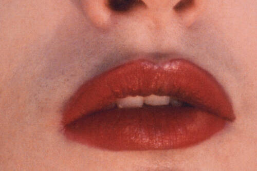
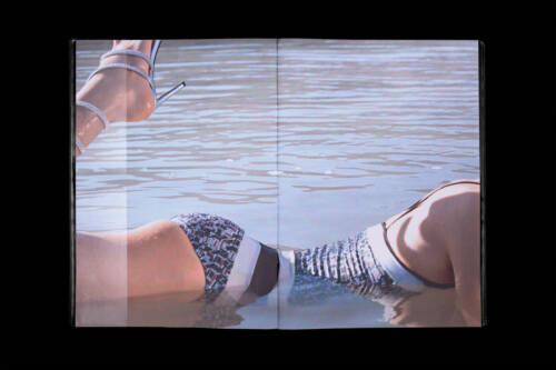
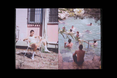
Dafy Hagai


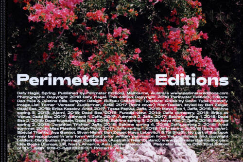

Design, Concept:
Ollie Schaich
Ruedi Zürcher
Collaboration:
Perimeter Editions
Photography:
Dafy Hagai
Interview:
Dazed
Dafy Hagai’s Spring sees the young Israeli photographer offer a new layer of complexity and fluidity to the visual languages and queer motifs. Shot amid the marginal urban spaces that punctuate Tel Aviv, Jaffa, Arad and Furadis – and punctuated with images from the more lush surrounds of Sakhne and the Dead Sea – the series lends a vantage on a gender dynamic that is as equally hard to define as its socio-geographical context. Here, Dafy Hagai juxtaposes members of Israel’s drag community against public passersby, and gender-ambiguous models against candid, more traditional visions of masculinity. We’re left in a kind of flux – a position that feels refreshingly authentic to our contemporary dynamic.
Mono Germany


Manufacturer:
Mono Germany
Design, Concept:
Ollie Schaich
Ruedi Zürcher
Photography:
Haw-lin Services
Fabian Frinzel
Code:
Felix Niklas
Welcome back, Mono Ring. The cutlery experiment Mono Ring, designed by Peter Raacke, goes back to 1962 and became a classic after being on the market for three decades. Far more than 1’000’000 units of flatware were sold worldwide. Peter Raacke’s idea remains strong: flatware that does not need a drawer and does not have to be placed next to the plate. Instead, it hangs visibly and handy on a cross-shaped rack in the center of the table, and diners around the table help themselves. As in the past, this design quality is again important and interesting today. In 2018, a new chapter in flatware history begins for Mono Ring. Revised and refreshed by Mark Braun in its form and available in five contemporary colors. In close cooperation with Mono, new design elements and guidelines were defined, which were introduced into the entire identity of the cutlery manufacturer in Mettmann after the release of Mono Ring. www.mono.de
James Tunks


Design, Concept:
Ollie Schaich
Ruedi Zürcher
Collaboration:
Perimeter Editions
Photography:
James Tunks
Photography represents a mode of conceptual, material and historical inquiry for Melbourne-born, Frankfurt-based artist James Tunks. An expansion from his 2017 solo exhibition Elsewhere at the Center for Contemporary Photography (Melbourne), his debut book Into Dust sees Tunks construct fake astronomical photographs using found and accumulated materials – crushed and pulverized to mimic interstellar nebular. While these sweeping vistas are immersive and engulfing in their aesthetic scope, their associated lists of materials come to form fascinating abstract texts, which echo the history of astrophotography and its pioneers (Edwin Hubble and EE Barnard among them) as adroitly as they tease out evidence of Tunks’ day-to-day. As such, Into Dust forges an ode to the genre and sketches an indirect self-portrait in the same breath. 44 pages, A4, saddle stitched, screen-printed linen softcover. Edition of 300. ISBN 978-0-9953586-2-1
Manuel Moreno


Design, Concept:
Ollie Schaich
Ruedi Zürcher
Code:
Felix Niklas
Video Sequence:
Sebastian Vargas
Animation:
Data-Orbit
Photography:
Jacques-Aurélien Brun
Tobias Siebrecht
Manuel Moreno is a music producer and disc jokey from Switzerland. For almost two decades, he has been taking his audience on a journey inspired by his long-standing relationship to music. The concept is based on his initials. The abstracted “MM” combination according to the clearly structured electronic beats. With the combination of different elements like pictures, videos, colors and animations, the grid starts to become alive and furthermore helps for the placement of typography – there are no limits. www.manuelmoreno.ch
Nicholas Building


Design, Concept:
Ollie Schaich
Ruedi Zürcher
Content, Research:
Christie Petsinis
Tim Wilson
Research project and unrealised book about the Nicholas Building. One of the most impressive buildings in the heart of the city of Melbourne. The building was commissioned by the philanthropic Nicholas family, who made Aspro (Aspirin in Australia) famous. The construction got completed by architect Harry Norris in 1926. The family’s idea was to create a hub for artists in a central location. The concept is still maintained today and the building can be found almost in its original state. The studios are used by a wide variety of disciplines in the creative field. Accordingly, a number of exciting stories and traces can be found. Before undergoing modernization in 2012, the Nicholas Building was home to the last manually operated lift in Melbourne.
Sam Wong


Design, Concept:
Ollie Schaich
Ruedi Zürcher
Photography:
Sam Wong
Published by:
Diane Inc.
Typeface:
Proto Grotesk
Sam Wong is a Melbourne photographer, specializing in editorial and art based practice. With Quarter Past One, he captured a whole bunch of awesome images from his photographic trigger finger. One year in the making, surveying a busy street corner of Melbourne’s CBD. With the book published by Diane Inc, and with an exhibition supported by the City of Melbourne, this project hones in on a particular mirror, exposing the action, excitement and mundanity that occurs every day at approximately a quarter past one (13:15).
Danse de Constance


Design, Concept:
Ollie Schaich
Ruedi Zürcher
Animation:
Data Orbit
Danse de Constance is a small electronic music festival, which takes place annually on the Lake of Constance in Switzerland. 350 like-minded people fit on board of the boat. For the 5 year anniversary coupons, tickets, bags, postcards and posters were printed on a transparent medium. The waves of water mixed with those of music were the starting point for the approach to typography. If light penetrates the defined elements, new and unexpected moods are created accordingly.
Soirée Graphique


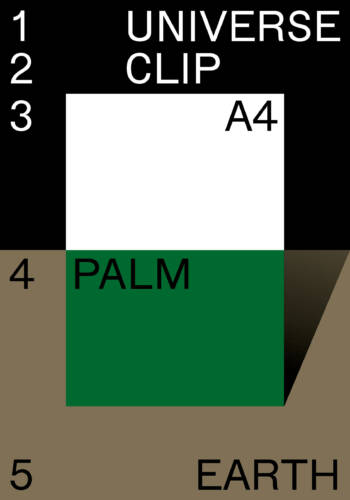


Design, Concept:
Ollie Schaich
Ruedi Zürcher
Photography:
Helen Korpak
Typeface:
Inhouse Gothic
Our dear A4 came all the way from the universe. She became friends with the little palm tree and is now chilling in the sun. Contribution to the Soirée Graphique Issue 9 NORDEN. Since 2008, Soirée Graphique has been promoting dialogue between artists from different creative disciplines. In 2016, 59 photographers and graphic designers from Denmark, Sweden, Norway, Iceland, Finland and Switzerland come together for an artistic exchange.
Textilmuseum


Design, Concept:
Ollie Schaich
Ruedi Zürcher
Animation:
Sénic
Furor Floralis: exhibition at Textilmuseum St.Gallen about the influence of flowers and gardening on textile. The watering can is the connection object of flower and garden with a positive connotation. 5 color offset print with a Pantone Silver background and in the digital implementation animated.
Bollhalder Eberle


Design, Concept:
Ollie Schaich
Ruedi Zürcher
Code:
Bänziger-Hug
Photography:
Ladina Bischof
The appearance for Bollhalder Eberle Architektur is based on a strict, but at the same time dynamic grid. The vertical lines vary depending on the format and define the column width. The grid lines continue as a subtle element in printed applications. In this case, a special bleach technic was used to imitate the character of a watermark in offset printing. www.bollhalder-eberle.ch
Saiten Postcard


Marazzi Reinhardt


Concept, Design:
Ollie Schaich
Ruedi Zürcher
Code:
Felix Niklas
Photography:
Ladina Bischof
Typeface:
Union Regular
Characteristic of Marazzi Reinhardt work is the display of raw materials and the talent to stage traditional details in a contemporary light. Their architecture finds surprising possibilities and potentials beneath the limits of a particular task. The visual identity is based on a simple and clear, yet flexible grid. Each format is divided in half exactly, defining the position of the copy and images. The typeface is used in two sizes only. A uniform grey scale runs from Marazzi Reinhardt’s print materials, to the background of the website and even into the premises of the office space. www.marazzireinhardt.ch
Kafi Franz


Design, Concept:
Ollie Schaich
Ruedi Zürcher
Typeface:
Monotype Modern
Etienne Pro
Kafi Franz invites you into a world between city flair and living room charm – warm, uncomplicated, and home-made. The name stands for fresh preparation and a creative seasonal cuisine.